


User journey map created after a week of stakeholder, user interviews and affinity diagramming. This was used to help our team and Beautycounter align on specific priorities for the MVP.
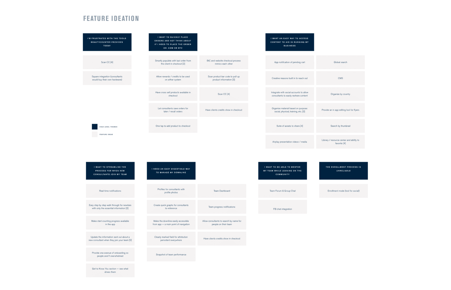
Output of affinity mapping and collaborative ideation sessions to surface themes and key paint points.

These future vision wireframes outline the ideal state app. Using the main themes and features that came up in affinity mapping we developed 5 tabs.
Building a business tool for consultants
Streamline order placement
Consultants need a way to efficiently order from their vast catalogue for their customers. Consultants often make sales and connect with people while they're out socializing, at parties, or at their children's sporting events. Currently they can only place orders through a cumbersome online system that only works on their desktop computer. Many consultants carry around paper order forms to take orders while they're out and about.
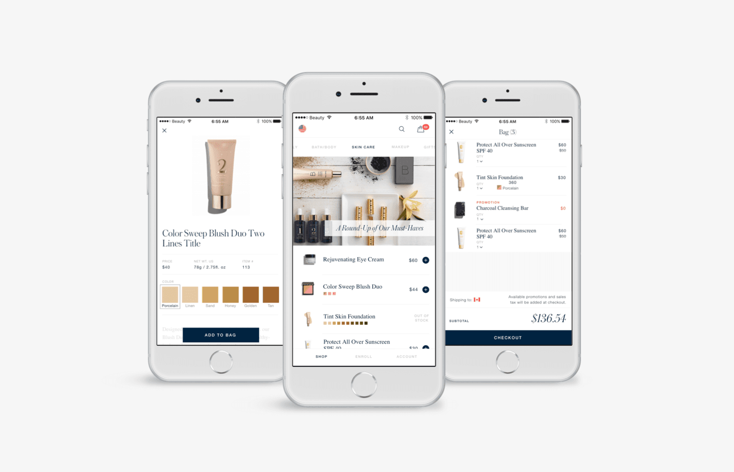
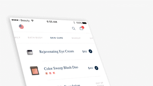
We designed a product catalogue and order flow that is optimized for efficiency. The Quick Add button allows consultants to add to cart without diving into each product that they already know by heart. This swiping left/right navigation system was heavily tested with consultants to ensure it worked for their particular use case.

Complete the order
Consultants have to consider a lot in checkout. They indicate which social event the items were purchased from, apply customer promotional credit, and ship to both the US and Canada. We created a checkout flow that allowed consultants to quickly tap in and out to account for all the information they need to edit and view their whole order in one scan.
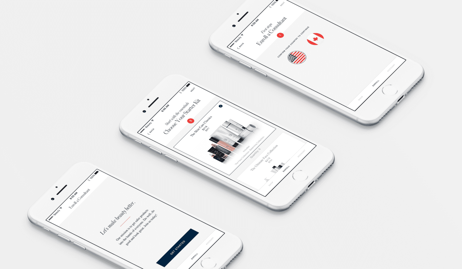
Consultants add new members to their team through a cumbersome desktop system that often fails. It leaves a negative first impression of the Beautycounter company and is demoralizing to the consultants. Beautycounter wanted a simple way to enroll new team members on the app.
Our solution provides a simple step by step flow, navigating through important decision points and collecting personal information.
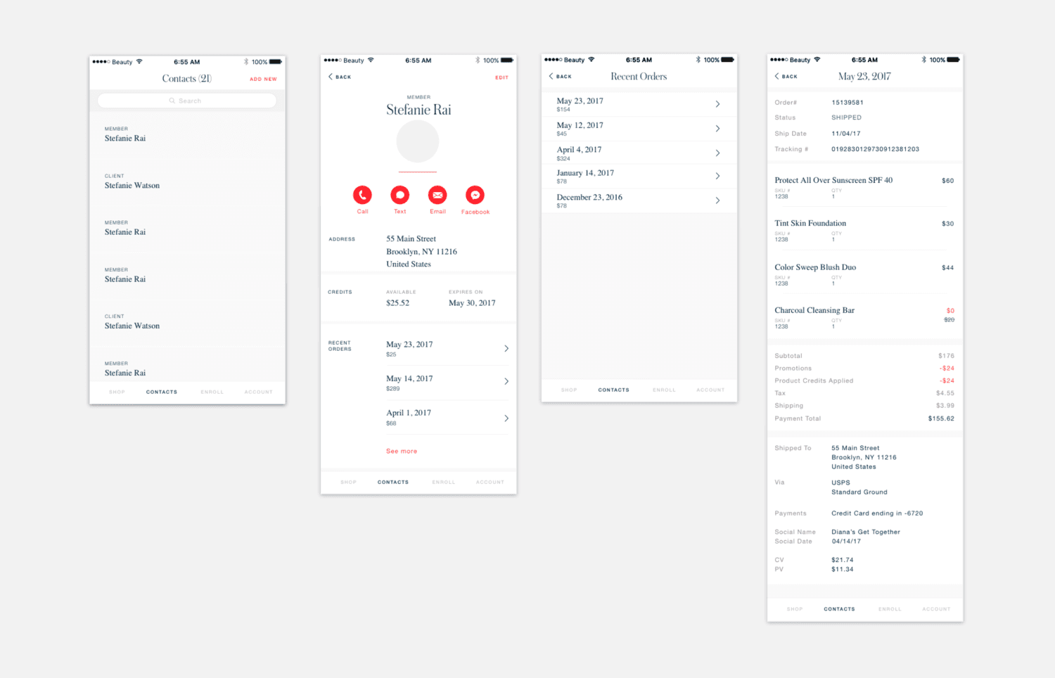
Consultants want all of their clients information at their fingertips, so they can follow up with them in a meaningful way while increasing their sales. We designed a client management tab for consultants to quickly reference their client list, view their past orders.
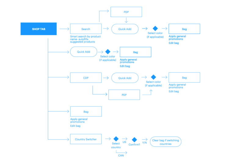
User flow shared with developers and stakeholders to align on a structure for the shopping tap.
Each design sprint we tested new screens and prototypes with Beautycounter consultants to validate our ideas and challenge our assumptions. We shared a weekly UX Digest with the team and stakeholders to share research and insights as we learned them. At the beginning of each sprint we developed a user flow for PM, developers and stakeholders